Serenity
Hotel Website
Client
Serenity
Role
UI/UX Designer
Year
2022
Industry
Hospitality
Introduction
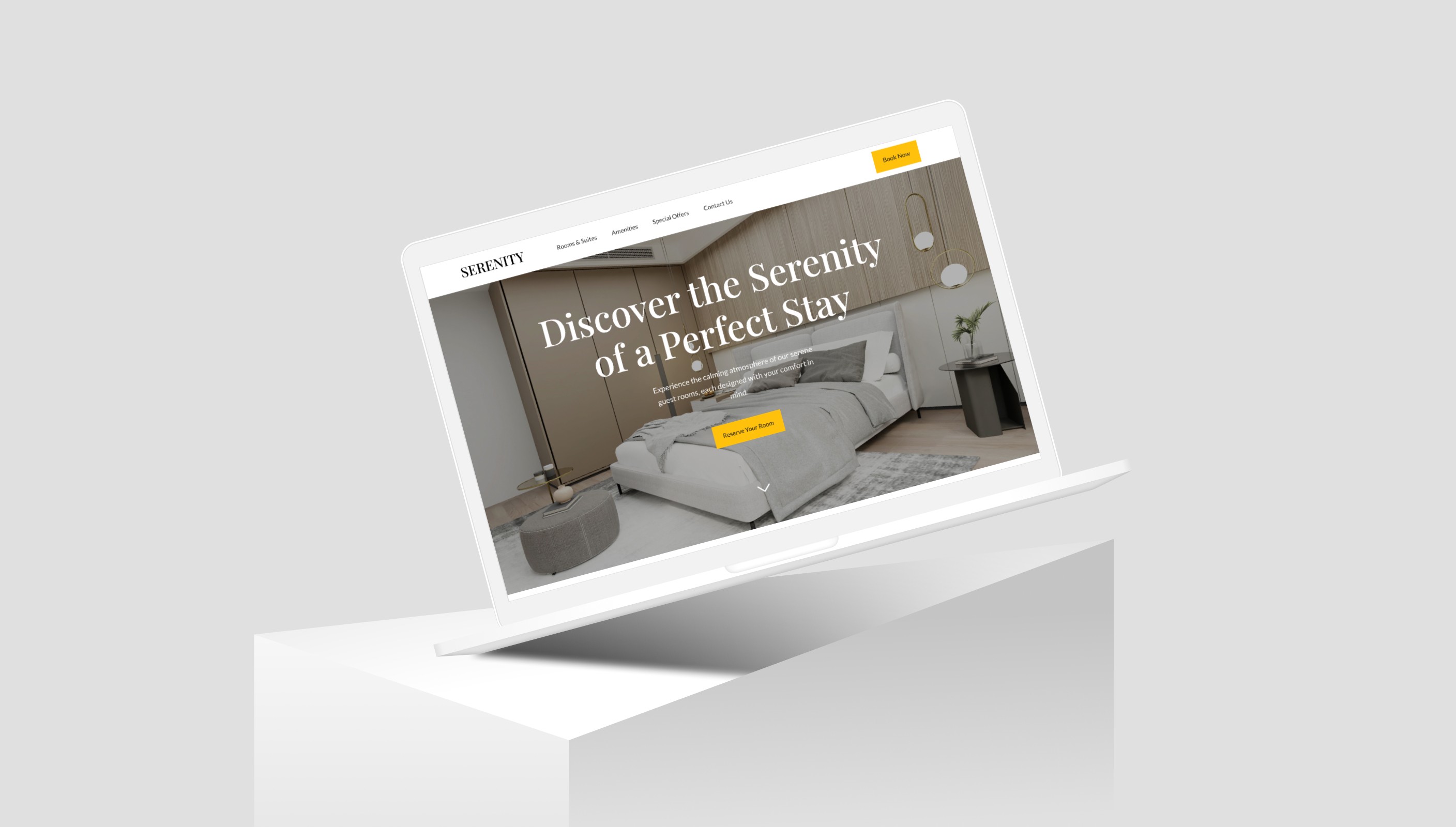
Serenity, a distinguished hotel aiming to capture the essence of tranquility, initiated a project to design and develop a captivating Hotel Landing Page Website. The primary objective was to showcase the hotel's serene and calming atmosphere, highlight unique selling points, present room and suite options, and promote special offers to entice potential customers to book a stay.
Research
The project commenced with thorough research to understand the hotel industry's digital landscape and identify user preferences when exploring hotel websites. Competitor analysis and user surveys were conducted to uncover design trends and customer expectations. This phase aimed to create a user-centric website that reflects Serenity's brand identity and provides an immersive experience.
Process
Conceptualization and Ideation: Collaborative brainstorming sessions were conducted to conceptualize the website's structure, emphasizing a clean and calming design. Figma was employed for creating wireframes and mockups, visualizing the user journey from landing on the page to booking a room.
Design Iterations with Figma: Using Figma, the design process involved iterative refinement of visual elements, color schemes, and typography to evoke a sense of tranquility. High-fidelity prototypes were developed, allowing stakeholders to preview the website's aesthetics and interactions.
Development with Framer: Web development using Framer involved translating the finalized design into a fully functional website. Framer's capabilities were harnessed to implement smooth transitions, responsive design, and dynamic elements that complemented the overall tranquil theme.
User Testing: Before the official launch, the website underwent rigorous user testing. Feedback from potential users was invaluable in fine-tuning the website's usability and addressing any potential issues.
Results
The Serenity Website was successfully launched, featuring a visually stunning design that effectively conveyed the hotel's serene atmosphere. The use of calming colors, high-quality imagery, and strategically placed CTAs contributed to an engaging and conversion-oriented user experience.
The website showcased the hotel's unique selling points, room and suite options, and special offers prominently. User analytics indicated increased user engagement, with a noticeable uptick in booking inquiries and conversions. The responsive design ensured a seamless experience across various devices, enhancing accessibility for users.
Conclusion
The creation of the Serenity Hotel Landing Page Website exemplifies a harmonious blend of design and development to achieve a serene and captivating online presence. The project showcases the commitment to user-centric design, leveraging Figma and Framer to create a visually appealing and functionally efficient website that aligns with Serenity's brand identity.
By immersing potential customers in the hotel's calming ambiance and effectively presenting its offerings, the website has become a powerful tool for attracting guests and encouraging bookings. The success of the project underscores the importance of a holistic approach to web design and development in the hospitality industry.
Serenity
Hotel Website
Client
Serenity
Role
UI/UX Designer
Year
2022
Industry
Hospitality
Introduction
Serenity, a distinguished hotel aiming to capture the essence of tranquility, initiated a project to design and develop a captivating Hotel Landing Page Website. The primary objective was to showcase the hotel's serene and calming atmosphere, highlight unique selling points, present room and suite options, and promote special offers to entice potential customers to book a stay.
Research
The project commenced with thorough research to understand the hotel industry's digital landscape and identify user preferences when exploring hotel websites. Competitor analysis and user surveys were conducted to uncover design trends and customer expectations. This phase aimed to create a user-centric website that reflects Serenity's brand identity and provides an immersive experience.
Process
Conceptualization and Ideation: Collaborative brainstorming sessions were conducted to conceptualize the website's structure, emphasizing a clean and calming design. Figma was employed for creating wireframes and mockups, visualizing the user journey from landing on the page to booking a room.
Design Iterations with Figma: Using Figma, the design process involved iterative refinement of visual elements, color schemes, and typography to evoke a sense of tranquility. High-fidelity prototypes were developed, allowing stakeholders to preview the website's aesthetics and interactions.
Development with Framer: Web development using Framer involved translating the finalized design into a fully functional website. Framer's capabilities were harnessed to implement smooth transitions, responsive design, and dynamic elements that complemented the overall tranquil theme.
User Testing: Before the official launch, the website underwent rigorous user testing. Feedback from potential users was invaluable in fine-tuning the website's usability and addressing any potential issues.
Results
The Serenity Website was successfully launched, featuring a visually stunning design that effectively conveyed the hotel's serene atmosphere. The use of calming colors, high-quality imagery, and strategically placed CTAs contributed to an engaging and conversion-oriented user experience.
The website showcased the hotel's unique selling points, room and suite options, and special offers prominently. User analytics indicated increased user engagement, with a noticeable uptick in booking inquiries and conversions. The responsive design ensured a seamless experience across various devices, enhancing accessibility for users.
Conclusion
The creation of the Serenity Hotel Landing Page Website exemplifies a harmonious blend of design and development to achieve a serene and captivating online presence. The project showcases the commitment to user-centric design, leveraging Figma and Framer to create a visually appealing and functionally efficient website that aligns with Serenity's brand identity.
By immersing potential customers in the hotel's calming ambiance and effectively presenting its offerings, the website has become a powerful tool for attracting guests and encouraging bookings. The success of the project underscores the importance of a holistic approach to web design and development in the hospitality industry.
Get Template for $9